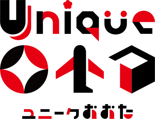
Ota City has created a brand message “Unique Ota” to carry out the promotion of the city. “Unique Ota” means that “Ota City is a city where people can encounter unique places that no other city can offer and only Ota can.”
We want many more stakeholders to use the logomark that conveys the brand message and work together to make the city’s attractiveness appealing.Please read through this guide together with the design manual for your active use.
The logomark was designed by combining the concept of “communicating various attractions” and “various motifs symbolizing Ota City.” Its red and black colors increase visibility and also represent Japanese-ness. Some letters on the logomark represent the image of Ota City as follows:
“Unique Ota” is a logomark designed by the students of Nihon Kogakuin College. Three finalists were selected among the entries at the initial screening, and a referendum was held during the period from November 20 to December 19, 2018. City residents (include commuters and students in the city) voted on the official website, etc. The design that gained the largest number of votes was selected officially as the Logomark for the Ota City Promotion.
City residents are also encouraged to use the logomark.
We would like your cooperation in promoting the city’s attractions.
(No application is required for non-commercial purposes. In such circumstances, you can use the logomark for free.)
Ota City Promotion Logo Use and Handling Guidelines
Form No.1 (related to Article 3)
From No.2 (related to Article 3)
From No.3 (related to Article 4)
Form No.4 (related to Article 6)
Ota City Promotion Logo Usage Guidebook
Ota City Promotion Logo Design Manual
Public Hearing and Public Relations Division, Ota City Office
TEL:03-5744-1132
Email:cp-ws-pubc@city.ota.tokyo.jp